A little advice from our Warwickshire web design HQ!
When it comes to web design, like many things such as fashion and fine art, the use of colour is vital. It is very easy to get carried away and use every colour in the rainbow in order to create what you think is a really appealing and attractive design. Creating effective colour combinations however is all part of the professional design process and comes with many years of experience in graphic design. So, here on a Friday evening after completing today's web design, Coventry is hosting some large sporting event (not quite sure what, think there's some coloured rings involved); and we are going to provide you with some useful colour theory advice!
So, what is colour theory?
Well, there are three components to colour theory. These are the colour wheel, colour harmony and the context in which colours are used. Let's talk them through one by one and explain a little about each.
1. The Colour Wheel
The very first circular diagram of colours was created in 1966 by Sir Isaac Newton. Since that time many different versions have been depicted by scientists and artists alike, but all take the same standard layout; being based on red, yellow and blue. There are three types of colour wheel that represent what we commonly refer to as primary, secondary and tertiary colours, these can be seen below.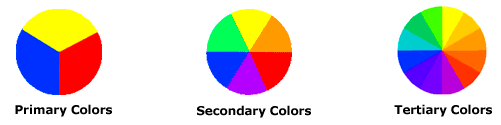
What are primary colours? - These are the three pigment colors that can not be mixed or formed by any combination of other colors.
What are secondary colours? - These colours are formed by mixing together the primary colours.
What are tertiary colours? - These colours are formed by mixing together a primary colour with a secondary colour.
2. Colour Harmony
A harmony is a composition of pleasing parts (in simple terms, 'things that go well together'). This might be a t-shirt that goes with a pair of jeans, a sauce that goes with your steak, or, in our case, a colour that goes with another colour. A colour harmony is acheived when something is pleasing on the eye and creates a visual state of balance and calm. The human brain will be underwhelmed by a lacklustre combination but at the same time will not take well to a chaotic mixture of colour, so a happy medium needs to be reached. One example of a way to select colours in your graphic design in order to acheive harmony is to select colours that lie directly next to each other in the colour wheel. Another method is to choose two colours that lie directly opposite each other in the wheel; though there is a common debate amongst designers that in alot of circumstances red and green should not be paired (unless it's Christmas of course).
3. Colour Context
Colour context is linked to colour contrast, and the way in which pairing two colours together can massively alter the appearance or impact of one of those colours. A bright orange square on a crisp white background will appear much brighter and larger for instance than that same square on a orange background; where it will start to blend in. However, the most surprising thing perhaps is that it will look brightest of all against a black background! Try it, you'll see!
We hope this article has given you an insight into just some of the complexities of colour theory and how much needs to be considered in all types of graphic design and web design.